Friday, December 4, 2015

Landscape: Activity 5

Marcia Hawea.
In the front we sort of see a hose looking thing, I don't know what to call it but its the first focus. In the fore background we see a line of parked, vintage cars. It looks cool because even though there are two focuses it all comes together and it looks really well portrayed and it adds a lot of depth. 


Landscape: Activity 4

Marcia Hawea. 
Portrait (Closed landscape): In portrait I feel like you're not able to capture a lot of the area around you but it can capture anything with length. For example, if there are any buildings that are tall, you would want to use the portrait method to be able to see hot tall something is and you can get it all in one shot but it may exclude some of the other stuff thats surrounding it.

Marcia Hawea. 
Landscape: I was going through my pictures and noticed that I used the landscape method more than I do the Portrait. It captures more and I think thats why I think I like it more. In this shot above I was able to get a hill, the clouds, and some bushes and trees. Use the method just as the title says, for landscapes. You can use portrait but in this method you are able to capture a lot more. 

Tuesday, December 1, 2015

cont. Frame and Composition: Activity 4

Create four images, placing the focal point and/or visual weight in different areas of the frame. Discuss whether each image is balanced.

Balanced:
This photo, I would say is Balanced. We have a beautiful area surrounding the model and we have the model placed simply on one side of the shot. This is one of my favorite pictures I've ever taken.
Marcia Hawea. 

This is a Balanced picture. We have a model on one side of the photo, while we have an area of bushes like things on the other side and together they compliment each other and make the photo look really nice. 
Marcia Hawea. 

Unbalanced:
This picture is Unbalanced because there are two main subjects in this picture. We have a windmill and a person both in the shot, which is cool but they both clash together and it makes the entire shot look Unbalanced.
Marcia Hawea. 

This picture is another favorite of mine but it's an Unbalanced photo. We have a view of the flowers which unevenly spread through the shot and then we have the Gilbert Temple in the background and it all clashes together in an unevenly way. 
Marcia Hawea.

Monday, November 30, 2015

Landscape: Activity 3


                                                Ed Mel.                                      David Edwards. 

Similarities: 
-Both the photographer and artist have the same subject idea. Theres a storm coming in what looks like what could be the Grand Canyon. They both include clouds and rock in the shot. 
Differences: 
-Edwards has a more realistic photograph than Mel does. 
-They have different angels. Mels view is more from the side, while Edwards is more from the top, side. 
-Edwards has a more detail in the photo then Mel does. Edwards, for example, has a river in the shot and two different types of rocks. 

Painters can really include anything they want in a painting while Photographers have to really look and work with what they have and get to an angel or position to get a good shot. With paintings its less realistic than an actual photograph. I feel like photographs can get  bigger message and feel across. 


Monday, November 16, 2015

Landscape: Activity 2

Photobucket. 
Looking at this picture, I feel like the photographers point behind it is pretty clear. They see a beautiful, natural landscape with a polluted lake. The pollution kind of destroys the entire image but also the literal view as a whole. It shows how we don't take care of the place we live and love. The photographer is trying to get across that were destroying something beautiful. We need to keep it the way it is so we can keep it like the way it is for a long time. 

Kevin Millins.
When I look at this picture the main word that pops up in my head is "society". I think the photographer is trying to show the Tokyo society as on whole. One single building makes a town and the town can make a city. Its kind of cool to see it from a full angle, as Tokyo being a lot bigger than what it is form an age of  being down there by a few of the building surrounding you. Then you get to a higher angle and see everything as it should be. I think the photographer made this an obvious point with this picture. 

 Example: What does the image below say about humans need to control the environment? Or, does it indicate an attempt to recreate a time long past and remind people of their outdoor beginnings? What do you think? Does it say anything different?
Unknown. 
In this picture, it seems that humans have destroyed the beauty of all the natural things of the world. A lot of that has been replaced with society and buildings. We can see how things are so busy and there are two different types of views in the photograph. I think it shows how we should stop and not ruin anymore of the real beauty of all the green and stop with the growth of the buildings. So we can have a piece of all the nature we've been given. 

Landscape: Activity 1

Walker Evans. 

In this picture I can see a main focal point, the cross. The cross is in a graveyard/cemetery type of area, by the looks of it. In the distance behind the cemetery is a neighborhood or town. It doesn't look like there is a lot of human activity. (In my opinion.) I think this picture can be considered as art. 1 because photography in general, I think, is considered as art. 2. I think if there is a message or reason behind the picture it can be considered as art. The message may be about death or a interesting view/ angel of a picture can show a point or story from the photographer. 

Monday, October 19, 2015

Light: Activity 4

Richard Martin.
Maximum Death of Field is closely related to Shallow Depth of Field. That means that the main subject is enhanced by throwing other elements out of focus. So pretty much, the main subject is clear and visible, while the background or things surrounding the subject is blurred so the viewer can focus on the main point.

Jess Meyer. 
The picture above is another example of Maximum Depth of Field. The best way to get shots like this is to be far away as you can or want, from the subject, because thats how you can portray DoF really well. You should set your camera to have a aperture priority. You can set your aperture to f/16 or smaller. With that you'll be able to focus better on your subject and blur the surroundings. 

Friday, October 16, 2015

Light: Activity 3

Unknown. 
With the picture above, its a dark setting and there is a cars headlights providing a light source. The photographer towards the light source but the subject is covering causing a silhouette type of effect, but not fully. We can see tiny details of the subject like the clothes but we can't really see the detail on their face. 

Emma and Sophie (Hello May blog).
With the picture above, the photographer has placed the subject in front of the light source but they shot the image towards the light. The light is a tiny bit hidden but it is peeking through past the subject. I think when the photographer took this shot they wanted the light source to create a feel and to be seen but not to take up and hide the subject. 


Light: Activity 2

Unknown.
The photograph above is a picture with one light source. From what I can tell the light is coming through what looks like, what could be blinds. The light is slightly peeking through, giving the photo a dark background and a spotlight on the main subject. The single light source allows the people looking at the shot, to focus just on the subject. 

Tyler Shield.
 The photograph above is an example of a picture with several sources of light. A lot of photographers who shoot celebrities, use a ton of light sources, that are normally placed in the front of them and on their sides. That makes the photo bright and I think it looks really nice because it gives the subject a bright quality. 

Thursday, October 15, 2015

Light: Activity 1

Hard Light: A harsh photograph, with harsh shadows. When I look at a photograph with hard light, I see a black background and I can see every little detail of the subject, more than I can normally in a regular shot. Clearly strong defined shadows. Natural hard light, sun is high, no clouds. 

Unknown. 

David Peterson. 


Soft Light: Soft light is diffused, shadows are gone or not seen. The background looks blurred to me and the subject is bright and well seen. I like soft light photography because it makes the photos mood happy even if the subject, like the photo to the right, has a serious face, I think using soft light bring a brightness.

Friday, August 14, 2015

Frame and Composition: Activity 4

Collect one image where the photographer has placed the main subject off center and retained a sense of balance and one image where the photographer has placed the main subject off center and created a sense of imbalance.
Discuss the possible intentions of the photographer in creating each image.

Balanced:
I would say this is a Balanced photo because int he background you don't have a lot going on. You simply have a few trees that a path way coming towards the photo. Then, we have one person riding their bike on one side which sort of balances the whole photo out.
Sarah Greenman.

Unbalanced:

I think this would go as a Unbalanced photo because it has the model, about in the middle of the shot but we also have other subjects unbalancing her out. We have the barn sort of thing in one corner. We have a horse, and then we have a van beside her. All of it just unbalances everything, which is sort of cool.
Tessa Barton.

Frame and Composition: Activity 1

Look through assorted photographic websites and observe how many photographers have moved in very close to their subjects. By employing this technique the photographer is said to ‘fill the frame’ and make their photographs more dramatic. Find two examples of how photographers seek simple backgrounds to remove unwanted detail and to help keep the emphasis or ‘focal point’ on the subject. Attach two images you find to your reply to this discussion.

In this photo, the photographer uses the close up technique by leaving out the unnecessary background around the model. The photographer also left out one half of the models face which is different than other photos I've seen before. This photo adds a lovely feel compared to regular photos we see of the model possibly with their whole body or even a background.
Melissa Ray Photography. 

I really like this shot because you could get the view of the persons whole body but you just get the shot of her neck, up to a bit of her nose. You can see pieces of her hair flying in the shot which adds a bit of detail, while her smile shows true happiness and joy. Using the close-up technique, you are really able to see that.
Unknown.


Wednesday, August 12, 2015

Frame and Composition: Activity 3

Find two examples of Photographs that follow the Rule of Thirds and two examples that do not. Comment briefly on why and how you think the composition works.

Rule of Thirds:  

If you put a 9 squared grid on this photo, the subject in on the side of the shot while the rest of the photo has the entire background shown. This picture is a good example of the Rule of Thirds technique. 
Jessica Janae Photography 

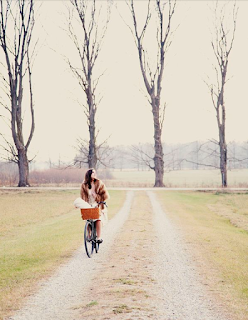
Again, this is a very good example of the Rule of Thrids technique. If there was a 9 squared grid put on the photo, the aubject is put on the side of the shot. 
Pati P. Photography 

No Rule of Thirds: 

Even though this is a good picture, it's not a good example of Rule of Thirds. The subject is placed right in the middle of the shot. 
Jessica Janae Photography 

Another, really good picture but It doesn't have Rule of Thirds applied to it. If you put a line straight through the middle, the subject is right there and that isn't a Rule of Thirds type of picture. 
Stephen Alkire Photography

Frame and Composition: Activity 2

O‘To quote out of context is the essence of the photographer’s craft. His central problem is a simple one: what shall he include, what shall he reject? The line of decision between in and out is the picture’s edge. While the draughtsman starts with the middle of the sheet, the photographer starts with the frame. The photograph’s edge defines content. It isolates unexpected juxtapositions. By surrounding two facts, it creates a relationship. The edge of the photograph dissects familiar forms, and shows their unfamiliar fragment. It creates the shapes that surround objects. The photographer edits the meanings and the patterns of the world through an imaginary frame. This frame is the beginning of his picture’s geometry. It is to the photograph as the cushion is to the billiard table.’

Q. What does John Szarkowski mean when he says that photographers are quoting ‘out of context’ when they make photographic pictures? 
A. When Szarkowski says "out of context", I think he means that photographers have a unique thug about them that they're able to show through their photos and make them fantastic. 
Q. The frame often ‘dissects familiar forms’. At the end of the last century photography was having a major impact on Art. Impressionist artists such as Degas were influenced by what they saw. Look at these examples of Degas work, which clearly shows the influence of Photography, and explain why the public might have been shocked to see such paintings.
A. Looking at Degas's paintings, I think that people were so shocked to see those paintings because many of them were nude shots of some sort. Maybe having people bare and shown like that was different through paintings. 

I could tell that this painting could be from a photo because it is a simple shot of an actual day or actual people. From what I see in paintings I see very imaginative or a lot shapes in paintings. This photo/ painting just shows a realistic day out to town.


Gustave Caillebotte.