Friday, December 4, 2015

Landscape: Activity 5

Marcia Hawea.
In the front we sort of see a hose looking thing, I don't know what to call it but its the first focus. In the fore background we see a line of parked, vintage cars. It looks cool because even though there are two focuses it all comes together and it looks really well portrayed and it adds a lot of depth. 


Landscape: Activity 4

Marcia Hawea. 
Portrait (Closed landscape): In portrait I feel like you're not able to capture a lot of the area around you but it can capture anything with length. For example, if there are any buildings that are tall, you would want to use the portrait method to be able to see hot tall something is and you can get it all in one shot but it may exclude some of the other stuff thats surrounding it.

Marcia Hawea. 
Landscape: I was going through my pictures and noticed that I used the landscape method more than I do the Portrait. It captures more and I think thats why I think I like it more. In this shot above I was able to get a hill, the clouds, and some bushes and trees. Use the method just as the title says, for landscapes. You can use portrait but in this method you are able to capture a lot more. 

Tuesday, December 1, 2015

cont. Frame and Composition: Activity 4

Create four images, placing the focal point and/or visual weight in different areas of the frame. Discuss whether each image is balanced.

Balanced:
This photo, I would say is Balanced. We have a beautiful area surrounding the model and we have the model placed simply on one side of the shot. This is one of my favorite pictures I've ever taken.
Marcia Hawea. 

This is a Balanced picture. We have a model on one side of the photo, while we have an area of bushes like things on the other side and together they compliment each other and make the photo look really nice. 
Marcia Hawea. 

Unbalanced:
This picture is Unbalanced because there are two main subjects in this picture. We have a windmill and a person both in the shot, which is cool but they both clash together and it makes the entire shot look Unbalanced.
Marcia Hawea. 

This picture is another favorite of mine but it's an Unbalanced photo. We have a view of the flowers which unevenly spread through the shot and then we have the Gilbert Temple in the background and it all clashes together in an unevenly way. 
Marcia Hawea.

Monday, November 30, 2015

Landscape: Activity 3


                                                Ed Mel.                                      David Edwards. 

Similarities: 
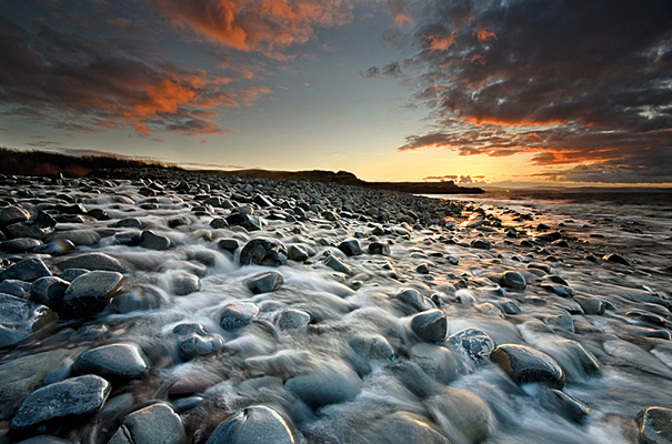
-Both the photographer and artist have the same subject idea. Theres a storm coming in what looks like what could be the Grand Canyon. They both include clouds and rock in the shot. 
Differences: 
-Edwards has a more realistic photograph than Mel does. 
-They have different angels. Mels view is more from the side, while Edwards is more from the top, side. 
-Edwards has a more detail in the photo then Mel does. Edwards, for example, has a river in the shot and two different types of rocks. 

Painters can really include anything they want in a painting while Photographers have to really look and work with what they have and get to an angel or position to get a good shot. With paintings its less realistic than an actual photograph. I feel like photographs can get  bigger message and feel across. 


Monday, November 16, 2015

Landscape: Activity 2

Photobucket. 
Looking at this picture, I feel like the photographers point behind it is pretty clear. They see a beautiful, natural landscape with a polluted lake. The pollution kind of destroys the entire image but also the literal view as a whole. It shows how we don't take care of the place we live and love. The photographer is trying to get across that were destroying something beautiful. We need to keep it the way it is so we can keep it like the way it is for a long time. 

Kevin Millins.
When I look at this picture the main word that pops up in my head is "society". I think the photographer is trying to show the Tokyo society as on whole. One single building makes a town and the town can make a city. Its kind of cool to see it from a full angle, as Tokyo being a lot bigger than what it is form an age of  being down there by a few of the building surrounding you. Then you get to a higher angle and see everything as it should be. I think the photographer made this an obvious point with this picture. 

 Example: What does the image below say about humans need to control the environment? Or, does it indicate an attempt to recreate a time long past and remind people of their outdoor beginnings? What do you think? Does it say anything different?
Unknown. 
In this picture, it seems that humans have destroyed the beauty of all the natural things of the world. A lot of that has been replaced with society and buildings. We can see how things are so busy and there are two different types of views in the photograph. I think it shows how we should stop and not ruin anymore of the real beauty of all the green and stop with the growth of the buildings. So we can have a piece of all the nature we've been given. 

Landscape: Activity 1

Walker Evans. 

In this picture I can see a main focal point, the cross. The cross is in a graveyard/cemetery type of area, by the looks of it. In the distance behind the cemetery is a neighborhood or town. It doesn't look like there is a lot of human activity. (In my opinion.) I think this picture can be considered as art. 1 because photography in general, I think, is considered as art. 2. I think if there is a message or reason behind the picture it can be considered as art. The message may be about death or a interesting view/ angel of a picture can show a point or story from the photographer. 

Monday, October 19, 2015

Light: Activity 4

Richard Martin.
Maximum Death of Field is closely related to Shallow Depth of Field. That means that the main subject is enhanced by throwing other elements out of focus. So pretty much, the main subject is clear and visible, while the background or things surrounding the subject is blurred so the viewer can focus on the main point.

Jess Meyer. 
The picture above is another example of Maximum Depth of Field. The best way to get shots like this is to be far away as you can or want, from the subject, because thats how you can portray DoF really well. You should set your camera to have a aperture priority. You can set your aperture to f/16 or smaller. With that you'll be able to focus better on your subject and blur the surroundings.